组件之 GfAlert
消息组件一般用于提示用户,比如通知,警告等消息。
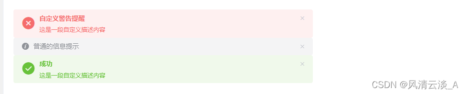
效果预览
属性
| 参数 | 类型 | 说明 | 可选值 | 默认值 |
|---|---|---|---|---|
| title | String | 显示的标题 | ||
| type | String | 类型 | ||
| effect | String | 显示的标题 | ||
| description | String | 描述 | ||
| closeText | String | 显示的标题 | ||
| showIcon | Boolean | 显示左侧的图标 | ||
| center | Boolean | 居中 | ||
| closable | Boolean | 关闭按钮 | true |
代码实现
这里我们使用了 function 组件来实现 space 组件,比较简洁灵活
<template>
  //动画效果
  <Transition name="el-alert-fade">
    <div
      :class="['el-alert',typeClass,center?'is-center':'','is-' + effect]"
      v-show="visible"
      role="alert"
    >
      <i :class="['el-alert__icon',iconClass, isBigIcon ]" v-if="showIcon"></i>
      <div class="el-alert__content">
        <span :class="['el-alert__title',isBoldTitle]" v-if="title || $slots.title">
          <slot name="title">{{ title }}</slot>
        </span>

        <!-- 描述内容两种方式都可以 -->
        <p class="el-alert__description" v-if="$slots.default && !description">
          <slot></slot>
        </p>
        <p class="el-alert__description" v-if="description && !$slots.default">{{ description }}</p>
        <i
          :class="['el-alert__closebtn',{'el-icon-close': closeText === ''}]"
          v-show="closable"
          @click="handleClose"
        >{{ closeText }}</i>
      </div>
    </div>
  </Transition>
</template>

<script>
const TYPE_CLASSES_MAP = {
  success: "el-icon-success",
  warning: "el-icon-warning",
  error: "el-icon-error",
};
export default {
  name: "GfAlert",
  created() {
    console.log("this is from alert888");
  },
  props: {
    title: {
      type: String,
      default: "",
    },
    type: {
      type: String,
      default: "info",
    },
    description: {
      type: String,
      default: "",
    },
    effect: {
      type: String,
      default: "light",
      validator: function (value) {
        return ["light", "dark"].indexOf(value) !== -1;
      },
    },
    closeText: {
      type: String,
      default: "",
    },
    showIcon: Boolean,
    center: Boolean,
    closable: {
      type: Boolean,
      default: true,
    },
  },

  data() {
    return {
      visible: true,
    };
  },
  computed: {
    // 类型样式
    typeClass() {
      return `el-alert--${this.type}`;
    },
    // 标题加粗
    isBoldTitle() {
      /**
       * 存在描述内容或者有插槽slots
       */
      return this.description || this.$slots.default ? "is-bold" : "";
    },
    //
    iconClass() {
      return TYPE_CLASSES_MAP[this.type] || "el-icon-info";
    },
    // 图标大小
    isBigIcon() {
      return this.description || this.$slots.default ? "is-big" : "";
    },
  },
  methods: {
    // 关闭
    handleClose() {
      this.visible = false;
      // 关闭后触发事件
      this.$emit("close");
    },
  },
};
</script>
使用
借用上篇文章 GfAside 标签,来测试下布局的效果
<GfAlert
  type="error"
  title="自定义警告提醒"
  description="这是一段自定义描述内容"
  showIcon
  @close="handleClose"
></GfAlert>
<GfAside width="600px">
  <GfAlert
    type="error"
    title="自定义警告提醒"
    description="这是一段自定义描述内容"
    showIcon
    @close="handleClose"
  ></GfAlert>
</GfAside>
这样,我们就实现了自己的 alert组件


![[数据集][目标检测]叶子计数检测数据集VOC+YOLO格式240张1类别](https://img-blog.csdnimg.cn/direct/d02585cac2d044e59a8ac7c8e5d5f8b8.png)